Layoff Tracker / Dashboard
The goal of this project was to create a filterable ‘feed’ for TalentOS - our talent acquisition platform, to display important recruitment data such as layoffs, hiring announcements, funding/IPO announcements, etc., equipping recruiters which new angles to poach top talent for their roles.
We wanted to personalize the recruiter's experience and also integrate the plethora of Return to Office data we received from ZoomInfo's acquisition of Comparably, allowing recruiters to target talent from companies based on work from home policies.
The team included a UX/UI Designer, PM, product director, many engineers and plenty of stakeholders.
Competitive Analysis - Tracker
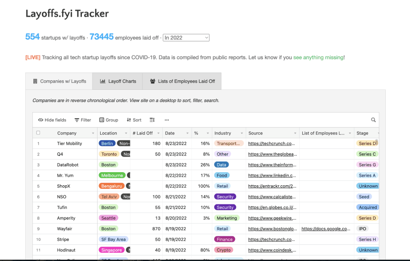
After receiving the PRD I started looking at online trackers to study from which were light-weight but had high usage numbers

Key Takeaways
Quick Filters: The UX of these trackers was consistent with quick filters between layoffs, hiring and firing news, etc., It made for a fast UX which I wanted to adopt as well.
Table-based layout to display more data: Most trackers also displayed the information using a table/sheet based layout which helps provide more information visually but could also lead to visual overload.
Providing a legitimate source is key to reinforce trust: Highlighting the source of the news was key as recruiters would still have to double check information before reaching out to candidates about it. A win would be to reinforce that trust so eventually users stop fact-checking and have trust in ZoomInfo's data.
Could provide advantage over competitors: At the time and to our knowledge, none of our competitors were planning around this feature and considering COVID's long-lasting impact on the job market, it made sense for us to invest and test this feature.
User Flow Iterations
Version 1: Initial Design
The first version of the user flow was designed as a foundational baseline, focusing on core functionality and initial hypotheses.
Version 2: Validating with Internal Recruiters
To validate the flow, I organized a focus group with our internal recruitment team—our ideal user persona. This involved significant effort: sending invites, scheduling sessions, preparing scripts, recording feedback, and collaborating with another designer for note-taking.
The insights uncovered key friction points - job role wasn't as relevant, news more than a month old didn't make sense showing, etc., and better ideas such as adding a location search, and allowing users to change the frequency of alerts., leading to a refined second version.
Version 3: Collaborative Refinement
In the third iteration, I collaborated with my Product Manager to align the flow with business goals and technical constraints. This version provided the structure for mid-fidelity designs, ensuring a balance between user needs and platform objectives.
UI Inspiration
For the UI, I drew inspiration from multiple sources. I analyzed our internal products to understand how they handle tables and similar components, ensuring consistency within our ecosystem. I also researched competitors to see how they’ve adopted similar features, identifying best practices and opportunities for differentiation. Additionally, I explored popular online trackers and general UI libraries, which provided creative ideas for refining the visual hierarchy and component interactions. This comprehensive approach ensured the interface was both intuitive and aligned with user expectations.
High-Fidelity Screens - Tracker
The high-fidelity prototype brought the user flow to life with polished visuals and interactive elements, simulating the final product experience. It was designed to closely align with the platform's design system, ensuring consistency and scalability. This prototype was used for usability testing with internal stakeholders, allowing me to validate design decisions, gather actionable feedback, and make necessary refinements before development.
Pain Point - Dashboard or Landing Page?
After designing and polishing the tracker, the biggest point of discussion became should it live in the app. Should we utilize the empty state of the 'Search' Landing page? Should we dedicate a new dashboard with the tracker and other widgets? Either way, this would be a huge undertaking and it blew up to become its own project in its entirety.
There was always an interest in utilizing the empty state of the landing page from a perspective of going beyond the core experience to create more engagement and insights.

A layoff tracker which gave you real-time insights, almost like a dashboard, seemed like a good candidate to utilize this space. My PM and I started collating research to help support this claim.
Competitive Research - Dashboards
I started looking at dashboards our competitors and similar B2B companies had.
Key Takeaways
Quick Filters: The UX of these trackers was consistent with quick filters between layoffs, hiring and firing news, etc., It made for a fast UX which I wanted to adopt as well.
Table-based layout to display more data: Most trackers also displayed the information using a table/sheet based layout which helps provide more information visually but could also lead to visual overload.
Final Flow
After all this research, I started building out the final flow with a dashboard as the 'north star' as combining the tracker and other widgets with the search empty state seemed to be over-saturating the content on that page for the user.
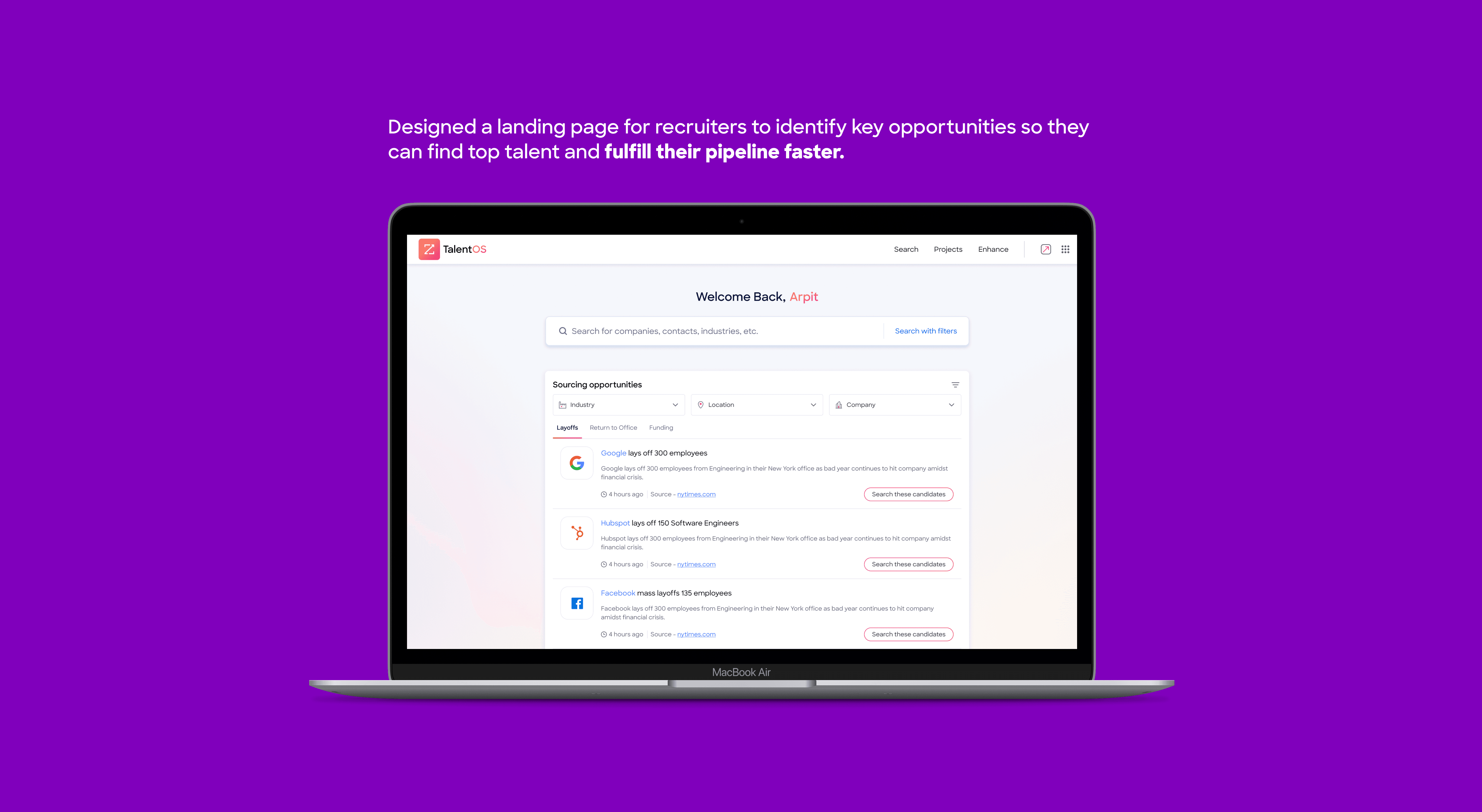
Final Solution: Dashboard
After tons of iterations, this was the final solution proposed to our senior stakeholders - a new dashboard for TalentOS
Takeaways
This project was a testament to the value of thorough research and a well-structured design process. From organizing focus groups and analyzing competitor solutions to testing prototypes and refining multiple iterations, every stage was driven by user-centered insights and collaboration. The sheer volume of research, ideas shared, and iterations designed demonstrated a commitment to delivering a solution that met both user needs and business goals.
Although product indecision ultimately halted this idea, the process and output were highly appreciated internally. The project not only highlighted the importance of thoughtful design but also showcased the potential of innovative, user-driven solutions—leaving a lasting impact on the team and reinforcing the value of UX within the organization.