Annual Reports Design
To start with, I wanted to learn the context for these reports and go through previous years reports to understand what works well and more importantly what doesn't.
I started with evaluating the 2020 digital reports and preparing a blueprint for the new websites. During this phase I also compiled recommendations resulting from benchmarking of composite peer-set companies.
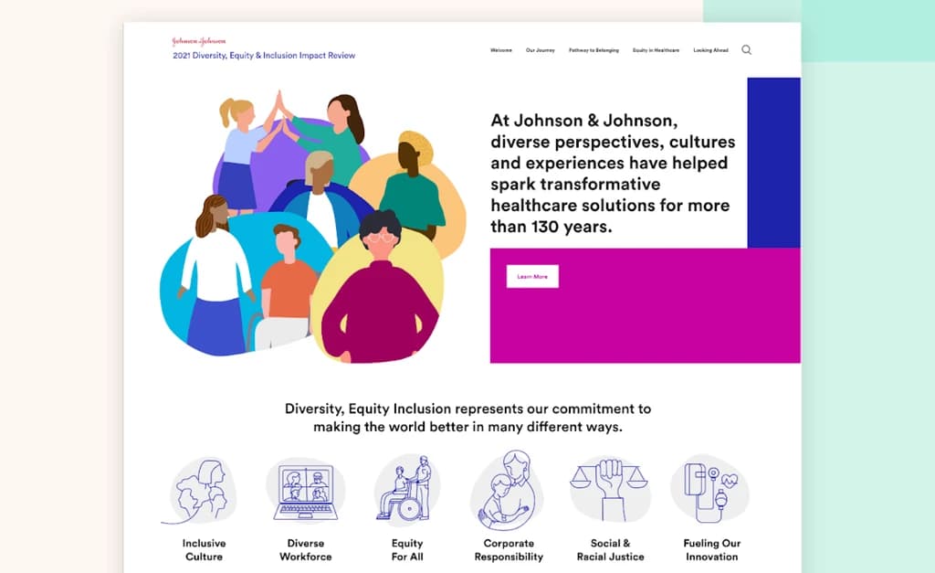
Bold photography, fun icons, and eye-catching infographics. Videos and animated elements like scrolling effects to make everything feel dynamic.
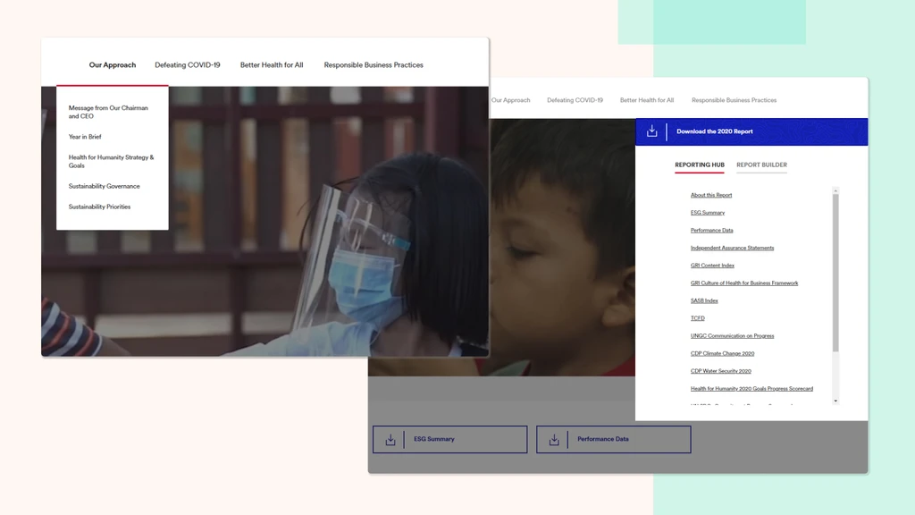
Simplified UX with seamless navigation, avoiding hidden pages. Report hub communicates information in simple, digestible ways.
Increased responsiveness, unique hero images for global representation, report archive, and future-proof URL strategy.
After researching both online and print versions of reports by 15 companies, I compiled key takeaways and recommendations to discuss with my project lead. The themes of a simplified navigation, visually-appealing graphics, and a strong narrative guiding the report, remained consistent and validated our existing research.


1. Insight-Centered Storytelling
Highlight key insights with impactful data visualizations and interactive elements like timelines or comparison graphs to keep users engaged.
2. Intuitive and Accessible Navigation
Use a simple structure with sticky navigation and accessibility features like font adjustments, dark mode, and screen reader options.
3. Dynamic Layouts
Keep users engaged with varied page layouts, animations, and parallax scrolling, while offering deeper content via downloadable reports.
4. Simple, Focused Homepage
Direct users to high-priority sections like highlights or featured articles with a clean, uncluttered design.
After understanding the UI requirements, I connected with stakeholders from JnJ to better understand the target user types for these type of reports and I learnt a lot more than I initially thought this would intended/designed for.
Looking for metrics and performance data to determine the quality of J&J as an investment. Also interested in content related to the CEO and strategy for future performance indicators.
Reviewing J&J's performance on specific issues and comparing them to other players in the industry. Policy makers may use this information to influence new policies or better understand trends in sustainability.
Interested in partnering with J&J, this audience may be looking at the site to determine what issues J&J focuses on to see if they are a natural partner.
For ranking bodies who don't request performance data in advance, this audience would be looking to pull data to rank J&J on their scale.
People considering joining J&J want to know what they stand for and what issues they are championing. They want to understand their values and see if they align with their own.
This audience can include people from academia analyzing the report, as well as members of the media looking to report on J&J's successes or failures.
From our research on past microsites and competitors, I designed 2 versions of the information architecture with simplified navigation, clear language, and intuitive groupings that aligned with user expectations. Since 2020 was a big year in healthcare in terms of COVID and J&J's frontline involvement in developing a vaccine, we wanted to highlight that work and stories but also not take away from all the other important global initiatives they focused on that year including work towards solving HIV, TB, Ebola and more.
 Version A
 Version B
I conducted a quick A/B test with internal designers of JK and stakeholders at J&J to evaluate which version they resonated with. For the navigation, the consensus (8/11) was around version B as it had simpler, more accessible language and had equal weight for each nav item. Interestingly, stakeholders preferred the version which didn't focus too heavily on COVID as its own section. We wanted the content and impact to speak the story for itself instead of giving it too much visual hierarchy as its own section in the nav.
I completed pixel-perfect mid-fidelity designs for both mobile and desktop screens, covering every page in the main navigation. These designs were handed off to the team at JK for high-fidelity polish, ensuring a smooth transition in the design process. I then collaborated closely with JK's designers, providing ongoing graphic support and ensuring the visual direction aligned with the project goals. This iterative process ensured a cohesive and polished final product.
Working on Johnson & Johnson's website as a fresh graduate was an incredible experience. It was one of my first large-scale projects for a major company, with high expectations and standards. I enjoyed conducting impactful user research, including competitive analysis and A/B testing, and designing the information architecture. Through mid-fidelity designs, I decided the entire hierarchy and layout for the reports, receiving positive validation through constant feedback from the talented designers at JK and J&J. Ultimately, the final prototype for both websites was well received and approved for development, which was very satisfying as I lived up to the team's high standards and contributed to the success of the project.
