Automating candidate searches to enhance recruiter efficiency.
As the sole UX designer responsible for developing a highly impactful feature at ZoomInfo, I had the unique challenge of creating an intuitive and seamless experience for the Candidate Search with Job Description Parser. This feature aims to simplify the recruitment process by allowing users to match job descriptions with potential candidates, leveraging intelligent parsing of job requirements.
Throughout the design process, I worked to ensure that the interface was not only functional but also user-friendly, keeping the end-users' needs at the forefront of the solution. In this case study, I will walk you through the design journey, challenges faced, and the strategies employed to deliver a streamlined feature that enhances recruiter efficiency.
The goal of this feature was simple - we wanted recruiters to be able to copy and paste a resume into TalentOS and let the system create a search automatically.
The biggest challenge for this project was the timeline. We were given only 3 weeks to conceptualize, design, research, test, and develop this feature to make it in time for the quarterly release. This was an incredibly daunting task but with the guidance of an incredible team around me we had to get it done. Given the fast pace of this project, I started with a very basic version of a PRD provided by my PM with the following requirements.
Apart an early draft of a PRD, I researched into what our competitors had iterated with their own version of this feature, if at all.
 Seekout's JD Parser
The simpler the better: Most parsers followed a very simple text-based UI to mimic the feel of Resumes and PDF's. The idea is for the back-end functionality to shine than UI to distract.
Space to improve Static UX: Most of these parsers are very static and made the entire UX of waiting for results to load feel longer since there was a dropoff in satisfaction whilst the results parsed from a JD.
One of the biggest pieces was determining where to put the trigger CTA in the application. Since we wanted users to start their flow using this feature, it made sense to position it front and center but also not too obvious to distract regular users from their usual workflows.
To begin with, I designed some alternatives. After multiple rounds of feedback with my UX Manager, and PM, we narrowed down our options to 2.
 Version A - CTA as the starting filter in the left panel
Version A wanted to keep this as its own filter since that was our most used area and the product had a track record of users not even exploring CTA's outside of this panel. This was a PM-led approach which went against UX principles and logic but we had to entertain this option.
 Version B - CTA on top next to search bar
Version B was the UX-backed choice as this was a search functionality which made sense to be in or around the search bar section.
To quickly move past this impasse, I reached out to a team of 7 internal recruiters to get agile feedback over preference quickly.
Patrick
"The filter really blends in with the other filters but for me it should stand out a bit as it's a bit different and more powerful than other filters."
Margaret
"I feel people tend to associate this with search and so I would look at the extreme top for the CTA."
Amy
"I like having all my search features in one spot so it makes more sense for me to have it in the filters."
Patrick
"On second thought, it makes more sense in the left-hand column. If this becomes part of my workflow, it would be step 1 of my process."
Margaret
"I agree, I start my searches with the left-hand side as it's all right there."
5 out of 7 recruiters preferred Version B over A as they resonated with the sentiment that it would be a search-related feature independent from filters and would act as its own unique starting point for the search flow.
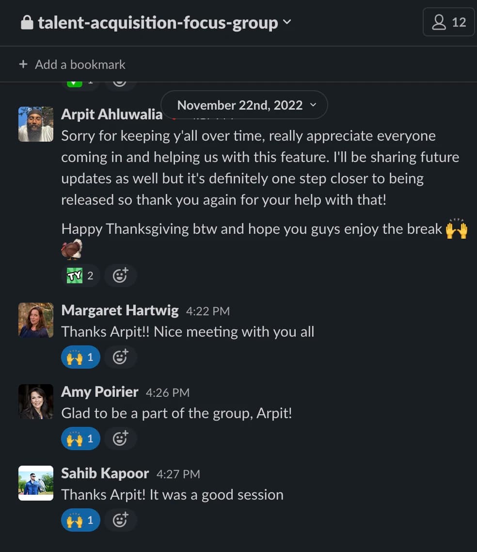
Given the tight 3-week timeline for the project, I adopted a rapid iteration approach. I quickly developed a lightweight, high-fidelity prototype that captured the core functionality of the job description parser. This enabled me to conduct early validation and usability testing with our internal focus group. The feedback gathered during these sessions was instrumental in refining the design, ensuring it aligned with user needs and business goals within the constrained timeframe.
Having one of my first projects being released and receiving positive feedback from our customers was an incredible feeling.
I also believe this initiative showcases rapid collaborative effort and synergy amongst cross-functional groups, and the incorporation of swift and budget-friendly user studies within the blueprint of product design. I had the opportunity to test and validate my solutions quickly with the focus groups and it was deemed really effective. So much so that it set a precedence of using focus groups for research in ZoomInfo.